Importance of UI in 2019
Here is all you need to know to get hold of a critical proposition of immaculate user experience in all the digital solutions. Digital solutions are making businesses compete at a throat-cutting level. It is one of the main reasons why it is becoming an altogether distinct dimension of competition. When there is a competition of a great UX, the product development team is bound to focus on UI. UI needs to be taken very seriously because often, people fail to justify the kind of importance and targeted effort it requires.
According to Forbes, a strategic effort to improve the UI/UX has the potential to increase the conversion rates up to 400%. It is said that the margin of error for UI design is very less. There is a considerable number of people who are not giving the due desired attention to UI designs (only 55% of companies perform any user testing).
UI design errors that can affect the conversion rate badly
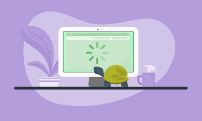
Website loading time
Website loading time is one of the critical factors that decide whether if you will be able to engage the customers or not. If it is taking too long to load, it has developed SEO penalties on your website and lowers rankings. Robust loading website is an added advantage and thus helps you increase your most probable customers with a clean UI, imparting an excellent user experience consistently. According to research, people are more expected to lose their customers, up to 40% if the website doesn’t load within the first three seconds.

Sight loading time is critical, and it can be easily achieved by:
- Reducing data-intensive API calls upfront
- Building lightweight graphics
- Optimizing requirement of bandwidth
- Securing the website against those attacks and unnecessary request
- Optimizing the performance of server link up with CDNs
- Taking a mobile-first approach
Responsiveness
Responsiveness has a significant effect on the overall user experience. Users are increasingly taking up solutions that are interoperable and allow handoff capabilities. By handoff capability, we mean that digital solutions which let the users carry on the same task while interchanging devices like PCs, laptops, mobile phones, and tablets. It is essential to ensure that your digital solution is offering a pleasant user experience. It should be up to the mark with the top user expectations, which can be created by using the distributor to approach any device.

If the product fails to create a similar or better user experience compared to one device from the other, the user creates a better perception of the solution. It can be misleading that this is precisely how customer psychology works at large. You should try ensuring a great user experience with a completely responsive UI design, not just at all types of devices, but with all resolutions corresponding to each devices. You can provide the web design responsiveness by:
- Manually testing your digital solution on various devices
- Consciously making efforts to ensure that the UI works the best in different resolutions during UI testing
- Keeping a point of UI design testing in the test suite
Related Article – Best Practices to Enhance Your Mobile App User Experience
What to Avoid?
Badly curated CTA
A poorly curated call to action is lethal, and it increases the risk of you failing towards the objective of creating a particular webpage. It is essential to position your request to work in the right place. It is an indication for why the page has been built on the website. A poorly curated call to action is also a negative point on your UI design. It leaves an impression that the site owner is perplexed about the primary offering and curate ultimate objective of making a webpage.
A poorly curated CTA causes:
- Scattered UI design
- A lower level of UX
- Low lead generation capabilities
- Critically flat conversion rate
- Low sales potential
Complex navigation

It is impossible to have a complexly navigated website and still have a greater UI design. The sophisticated UI navigation directly means that there are high chances of content layout mess at all screens. A lot of shipping within pages and several sections of a website makes you disobey the laws of human-computer interaction and a much-required recall-ability during the UX. Users often have unpleasant UX having a tough time navigating through a complexly-structured site. They might even lose out interest before they eventually reach a service page or a product offering that they were initially looking for.
Too much content
Too much content is a huge NO. Content is required for SEO capabilities and enriching brands visibility across the Internet. It also helps to convey the right vision and establish your brand Persona with utmost clarity. But, it is essential to stay within the fine line of excessive content posted on the website and the required material. Having rightly designed content layout with well-structured text boxes is one of the core tricks that you need to learn. It is essential for understanding the combination of art and science behind UI design.

Having too much content on the website can lead to going:
- Lost constant more interest
- Bad user experience (UX)
- An unimpressive first appearance
- Difficulty in engagement
Related Article – Top 5 Tips to Design & Develop iPhone Apps
Stock images
Stock images cause a dent on a brand image. Using open-source photos that don’t look real and have a lousy pixel quality eventually ruins the conversion of experienced audiences from having exposure all around the web. You should refrain from using stock images on the UI design, headers, and photos and also should focus on self copyrighted researched visual content for the website.

NOT hiring a design expert
The greatest mistake that you can commit while designing a website is to think that your visualization and technical skills are more than enough for a top-notch UX for your superlative brand. The complete UI design expiration can go for a quick toss the moment when you decide not to hire anyone. UI designing is a combination of art and technical skills. It is one of the more prominent professions in the world and it has a never-ending demand. You should mutually respect the core requirements of your website of a great UI design and hire the best UI/UX designers.

Hiring a UI/UX designer helps you in:
- UI testing
- Lightweight graphics for UI
- Adhering to UI design rules
- Picking up the right pattern
An important point to note!
There are various aspects which you may find worthy of being implemented while designing the UI, but a typical bookish approach can also mislead you to a ruined UI, which ultimately hurts the overall conversion rate. UI/UX designers have to closely work in tandem with higher sales and technical channels. These inputs are significant for new-age products, e-commerce websites, and newcomers of all digital business sections. It helps them in creating a credible reputation of the brand for long-term sales growth.
Final word
The exceptional UI design is something that all digital nomad and entrepreneurs aspire. It is an evergreen requirement in the digital business. It is essential to follow systematized design thinking that eventually leads you to question yourself and making out a thoughtful UI design. Every element must be having a distinct contribution to the UX. There should be nothing excessive or tacky. A minimal UI design is the foremost requirement of your brand to succeed in creating a tremendous digital expression through the UX. UI/UX designing is evolving with changing customer expectations as Millennials are looking for something more each and every time they look for new user experience. UI/UX design is expected to be capable of powerfully impacting your business at a large scale in coming years.
Related Article – Why should you follow the top UI trends and redesign mobile apps in 2019?


